
Aeyesafe · B2B · SaaS · Healthcare

MY ROLE: Product Designer
PROJECT TYPE: 0-1
DURATION: 6 weeks
PRODUCT RELEASE: December 2023 (BETA)
Aeyesafe is a smart monitoring system that helps care homes keep seniors safe - without wearables or cameras.
Instead of relying on devices that older adults may forget or resist, it uses discreet sensors like thermal, radar, and sleep monitors to track well-being and flag unusual behavior. Caregivers get real-time alerts, so they can act quickly and prevent emergencies.
Created 0–1 Alert System for Safer Senior Care
PROBLEM TO SOLVE
Caregivers in senior homes often face an overwhelming number of alerts. With limited time and high volumes, important alerts can get lost in the noise. When alerts aren’t prioritized clearly, caregivers may miss critical issues, creating serious safety risks for seniors.
RESEARCH
Since there wasn’t much existing insight into the challenges care homes faced, I took the lead on user research to better understand their workflows and needs. I wanted to make sure I was designing based on real-world problems, not assumptions.
The insights shaped the product direction early on and gave the team a clearer picture of where to focus our efforts.
Methods
Secondary research and semi-structured user interviews
Research Findings from Secondary Research
50%
Exceeded expected response times
Participants
5 care home administrators
Timeline
1 week
Research Findings from User Interviews
The real challenge for care homes isn’t just the number of alerts - it’s the risk of missing critical ones and the limited time they have to respond.
“When an alert comes in without context, I have to stop what I’m doing to track down the details. That slows everything down.”
10%
of calls canceled
over 3%
of calls forgotten entirely
Lack of context delays action, while new alerts keep piling up.
“It’s overwhelming - by the time I understand one alert, there’s already a backlog of others waiting.”
“If I had the right information upfront, I could prioritize and act faster instead of playing catch-up.”
GUIDING PRINCIPLES
🔺 Prioritization
Design alerts for quick scanning, making critical issues stand out clearly while minimizing cognitive load.
⚡ Actionability
Alerts should be easy to understand and act on, enabling quick responses and eliminating unnecessary steps.
🧩 Context
Each alert should present key details upfront, giving users the clarity they need without requiring additional searches.
IDEATION
To translate the research findings into actionable insights, I created two key artifacts:
Storyboard
High-level user flow.
Storyboard: The Resident-to-Resolution Journey
The storyboard visually mapped the sequence of events from the moment a resident experiences a critical issue to the point of resolution by the care home administrator.

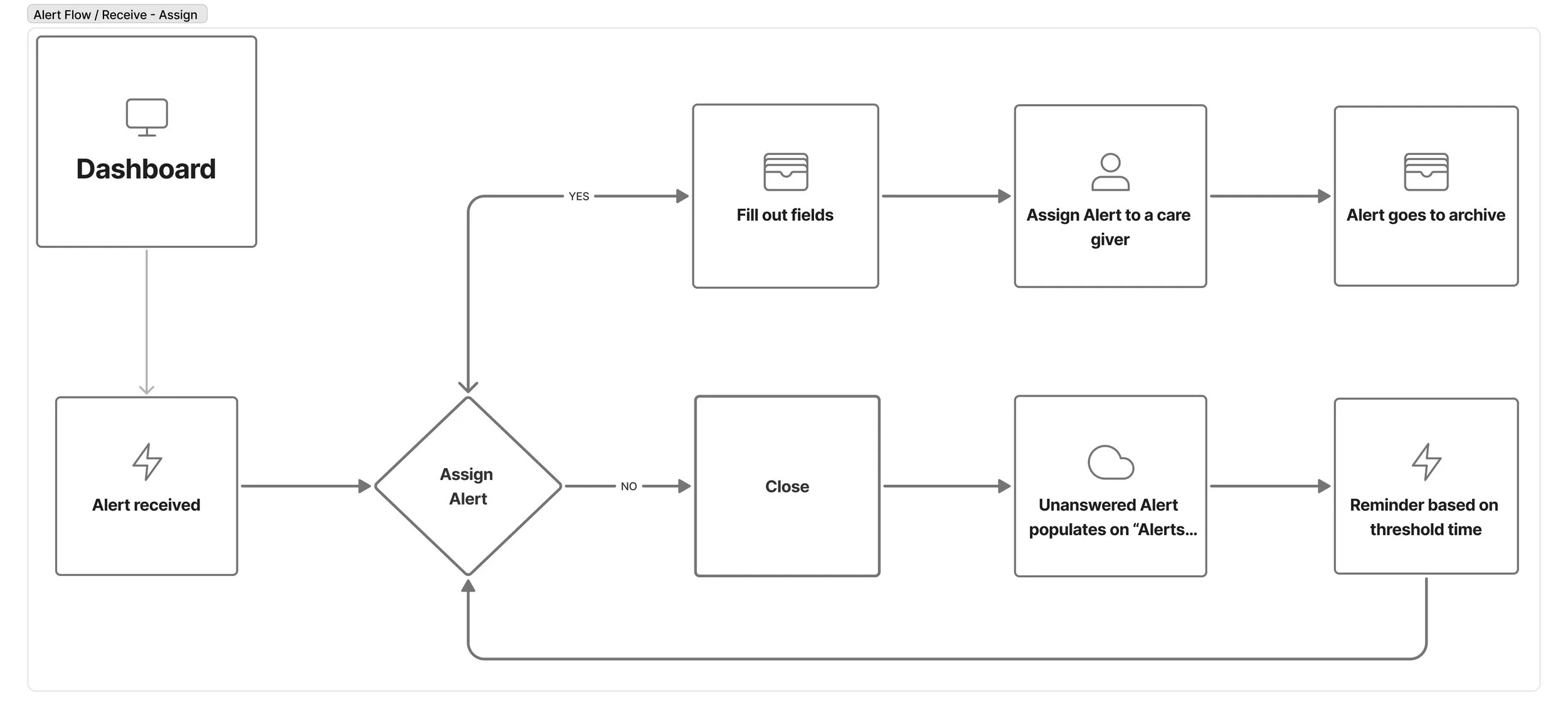
User Flow: System-Level View
In parallel, I developed a high-level user flow to understand how users would interact with the system internally. This flow maps entry points, branching logic based on alert types, and quick-action paths. It helped pinpoint two core decision moments:
How multiple alerts are grouped or collapsed
How fast assignment and follow-up actions are triggered from each alert card
DESIGN EXPLORATIONS + DISCOVERY WORKSHOP
Turning insights into low-fidelity prototypes, I prioritized the alert notifications first - users’ biggest pain point. Instead of overwhelming them with vague alerts, I aimed to surface the right information at the right time.
I partnered with two product designers to explore early design directions and ran co-creation workshops with three administrators to validate assumptions and find the right balance between clarity and actionability.


DESIGN
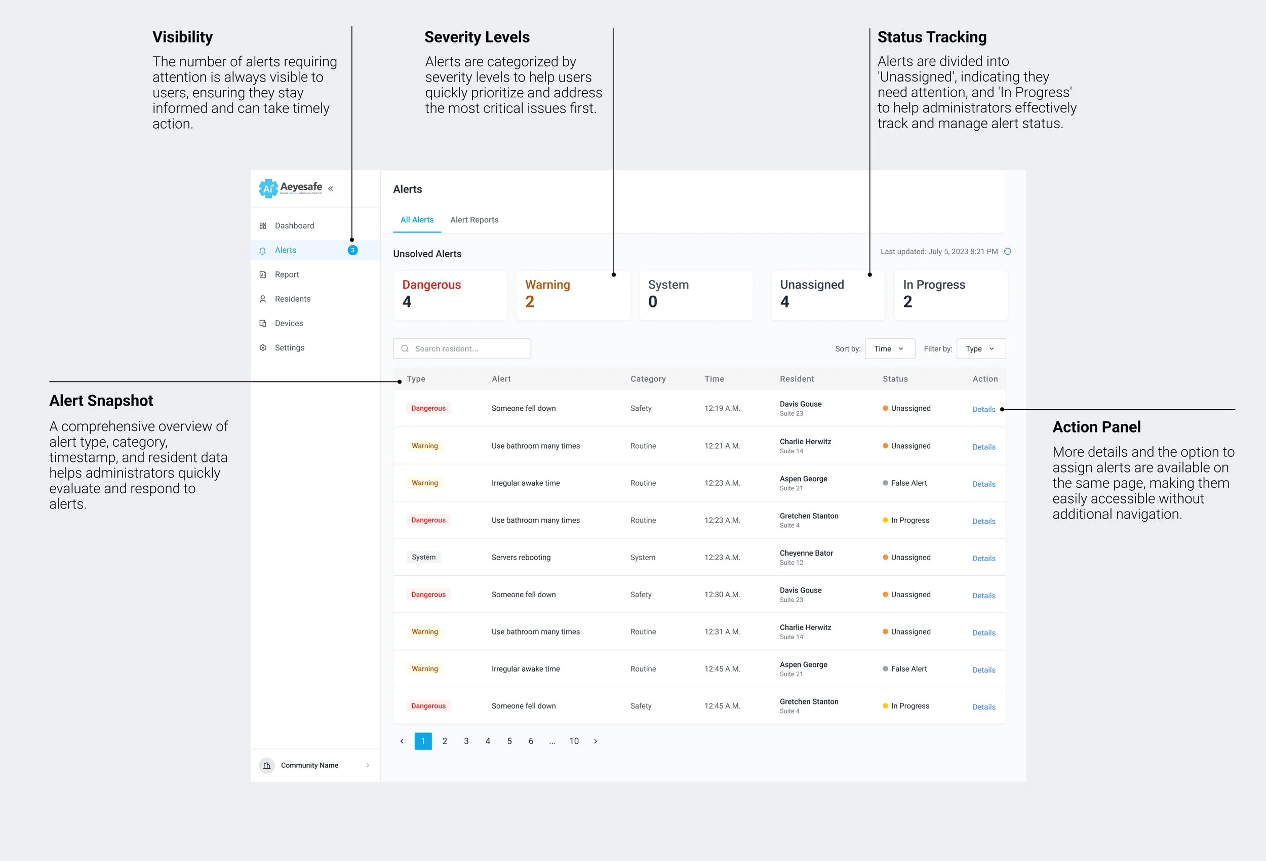
Once alert notifications were finalized, I moved on to the Alert page - the central hub for monitoring and action. Using insights from user interviews, I collaborated with other product designers to refine the layout, highlight critical information, and streamline quick actions.
I also worked closely with engineers to ensure the page was scalable, intuitive, and easy to navigate, enabling administrators to manage alerts with confidence.
The next step was to ensure a cohesive, end-to-end experience by addressing dependencies across the system. I began designing the intermediate steps and micro-interactions that connect key moments in the alert workflow - focusing on transitions, confirmations, and user feedback.
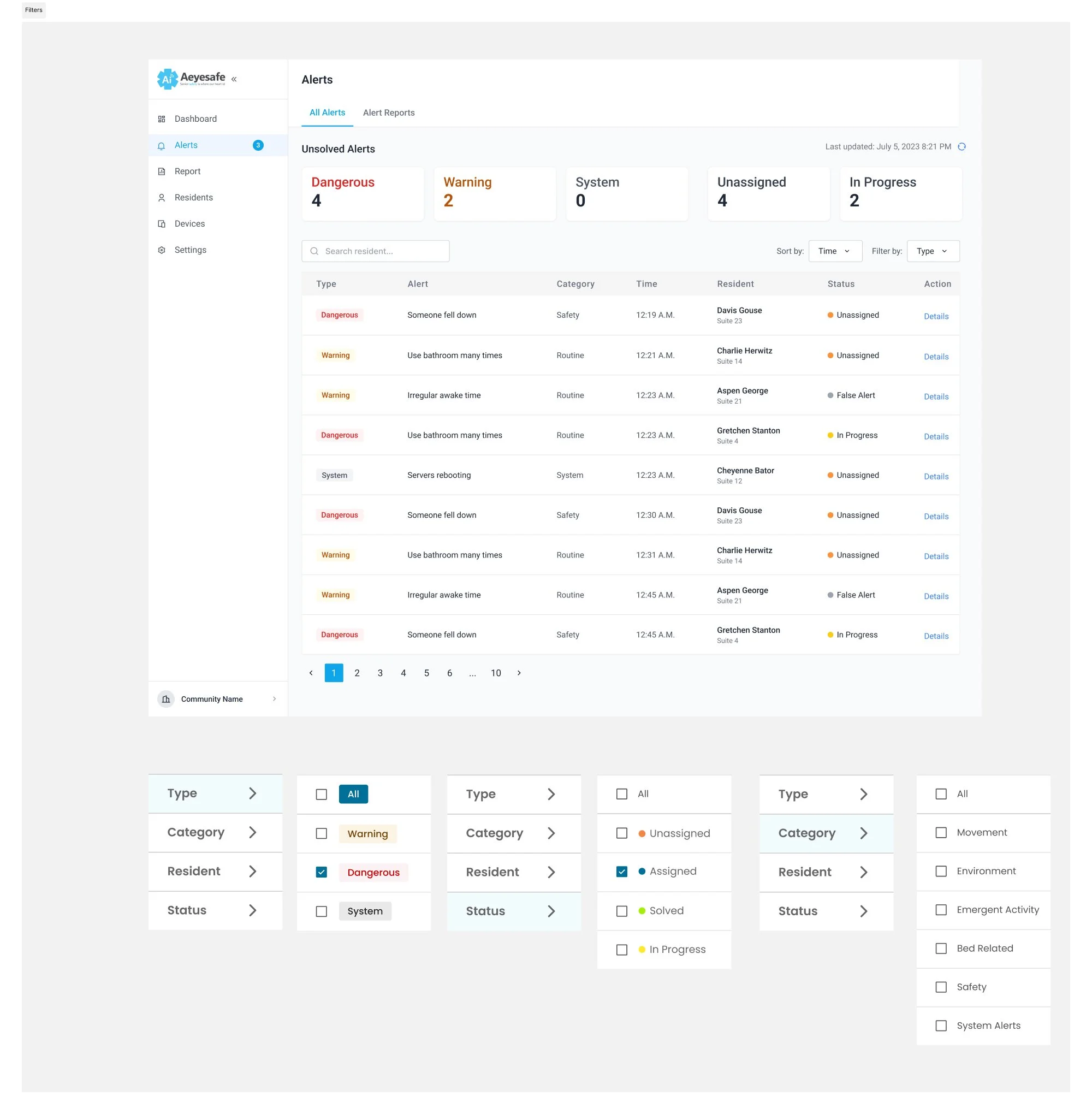
Alert Filters
Caregivers were overwhelmed by too many alerts and no clear way to prioritize. We designed flexible filters by type, time, resident, and urgency - so they could quickly find what matters and act faster.
Resident Alerts
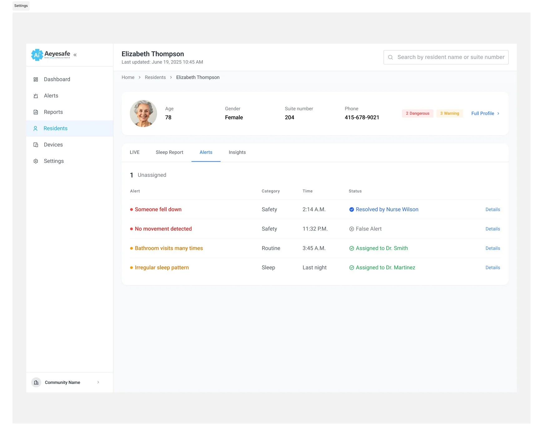
ALERT HUB
We made it easier to monitor each resident by showing alert history and status directly on their profile, giving administrators quick, context-rich insights without switching screens.

Alert Reports
To help administrators spot patterns and improve care, we added reports that surface trends across the past 12 hours, week, or month, broken down by alert type or resident.
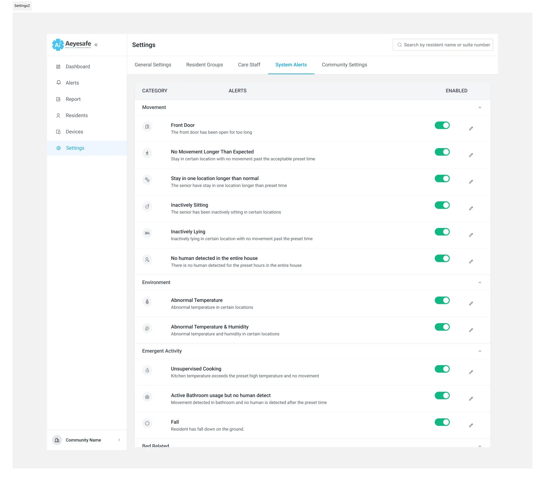
Custom Thresholds
Since every care home has its own protocols, we made alert thresholds adjustable, so teams can set the right level of sensitivity for their needs.
Outcomes & Next Steps
Delivered a working framework in 6 weeks, ready for engineering.
Next steps: Collect data from pilot, fine-tune thresholds, and expand reporting features
Reflection
This project taught me:
In safety-critical environments, too many alerts are as dangerous as too few.
Simple, clear actions reduce stress and help staff coordinate better.
Privacy-first design is not a limitation—it can be a chance to innovate.