
MTS Bank · B2C · Mobile · Finance
Redesigned Refinance Experience to Help More Borrowers Save
MY ROLE: UX Designer
COLLABORATION: Design Lead, PM, Engineers,
Legal, Marketing
TIMELINE: 10 weeks
MTS Bank set out to improve the loan refinancing experience in its mobile app, used by over 5 million customers. As a UX/UI Designer, I helped redesign a high-drop-off flow to reduce friction and increase completion.
PROBLEM
Customers were leaving the refinancing flow before they even saw their loan options. When customers exited this early, the bank couldn’t show them a lower rate or help them save money, which meant missed opportunities to strengthen customer loyalty and grow long-term relationships.
BUSSINESS GOAL
Increase conversion rates by reducing drop-offs in the refinancing flow through clearer labels and improved information, helping more users reach the rate comparison screen and complete the process.
FOCUS
This case study focuses on customers who get their salary paid directly into their bank account.
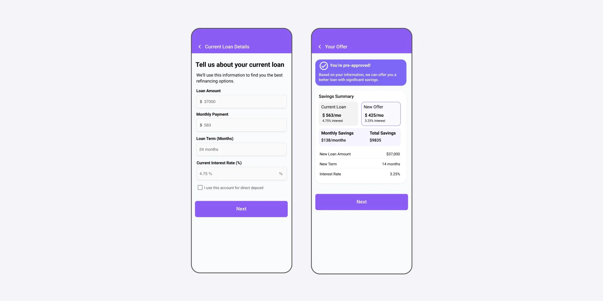
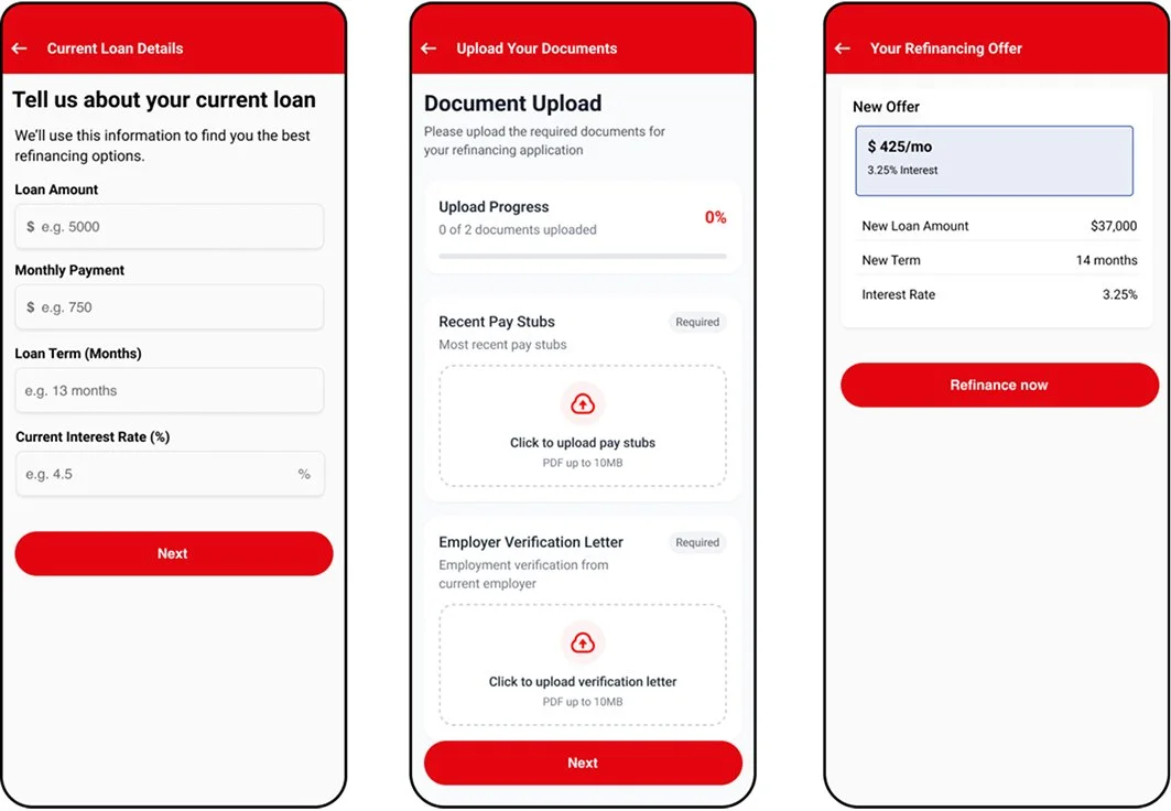
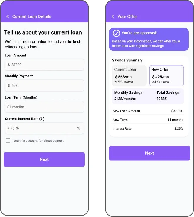
BEFORE
AFTER
CUSTOMERS DROPPED OFF
To understand the scale and location of the problems, I partnered with the Product Manager and the data analytics team to see where exactly the flow was breaking. I needed to look at how people were actually moving through it, so we reviewed the step-by-step data for the refinancing journey. Things like how many people started, where they continued, and where they stopped.
INSIGHTS FROM CUSTOMERS
“I didn’t understand why I should refinance with MTS Bank instead of my current loan. The benefits weren’t clear until much later.”
Value Must Be Obvious Upfront
Customers want to immediately understand why refinancing is worth their time - savings, rates, and benefits need to be clear from the first screen.
Uncertainty Creates Friction
Eligibility, required documents, and next steps were not clearly explained, leaving users unsure whether they could even complete the process.
Experience Feels Complicated
Inconsistent labels, unclear instructions, and fragmented screens made the process feel riskier than it should.
DESIGN EXPLORATION
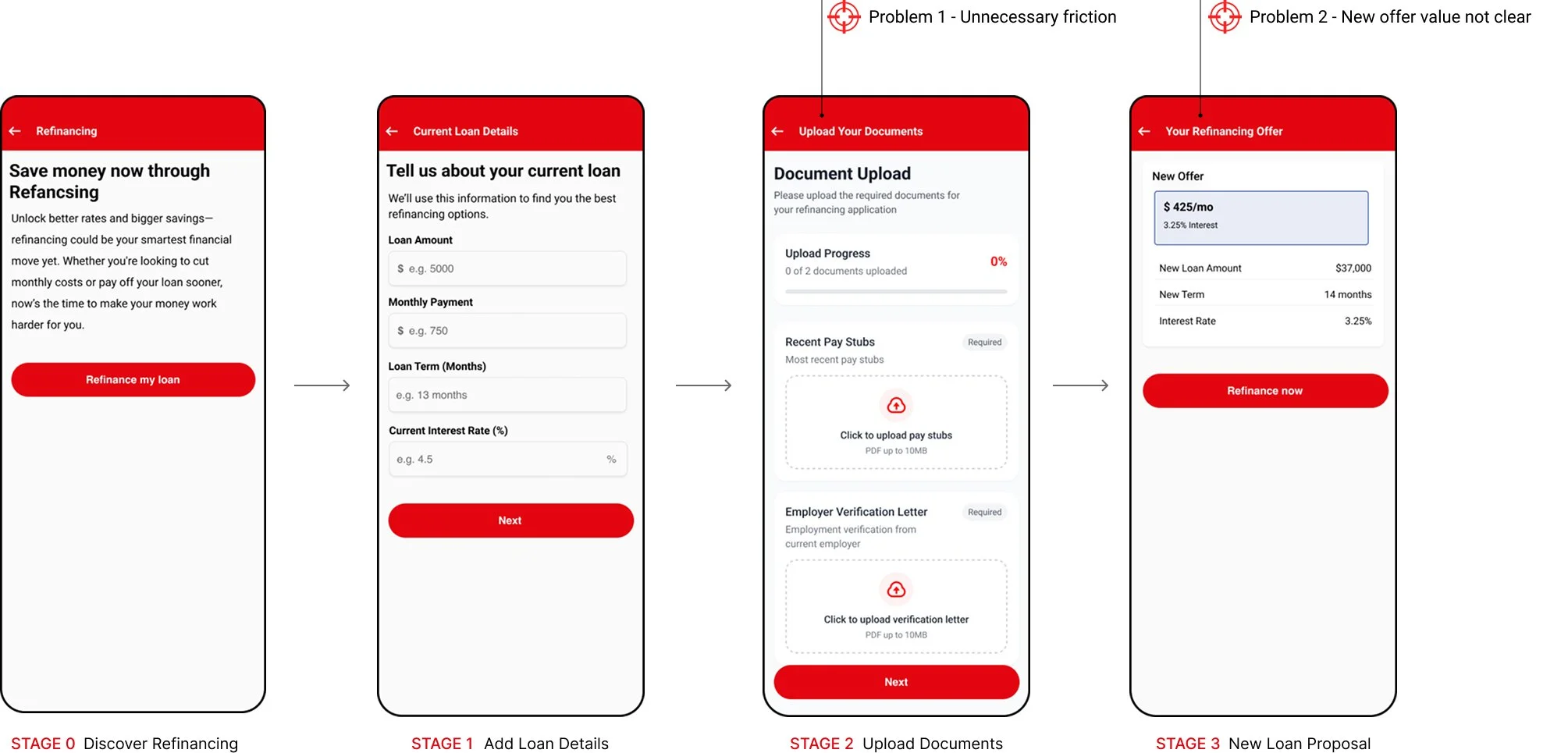
PROBLEM 1 - Document upload
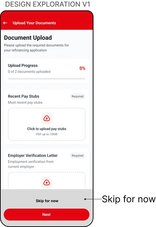
💡ASSUMPTION (V1)
Customers don’t have documents available on mobile
🔴 USABILITY TEST
Customers didn’t understand why the documents were required
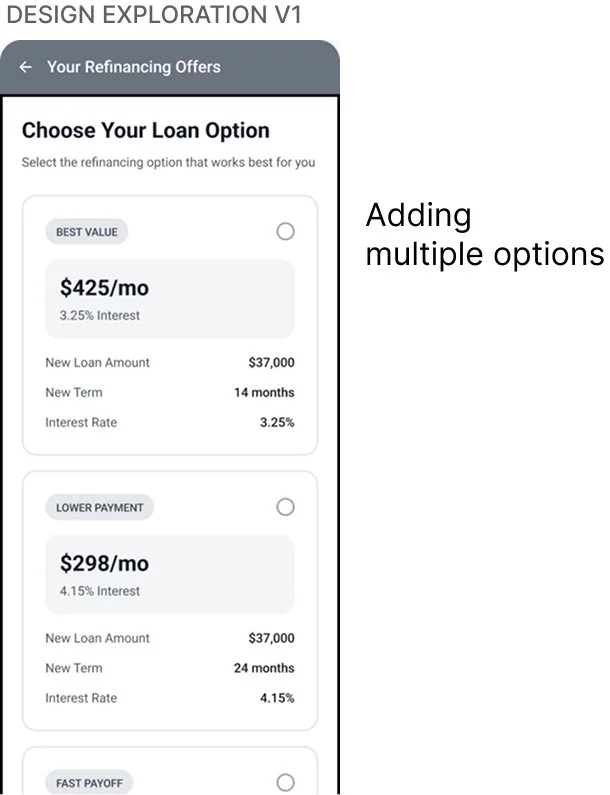
💡ASSUMPTION (V1)
Offering several refinancing options will give customers more control
🔒 INTERNAL CONSTRAINT
Not feasible - the bank only offered a few refinancing options
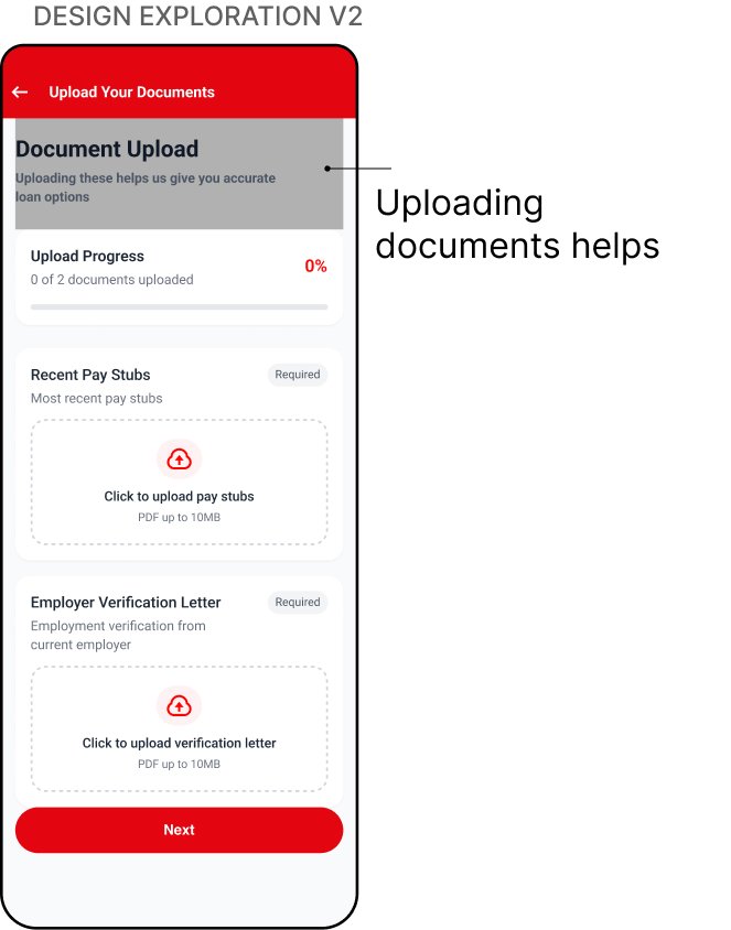
💡ASSUMPTION (V2)
Clearer messaging will motivate customers to upload documents
🔴 USABILITY TEST
Customers still viewed the upload as unnecessary
PROBLEM 2- Value Proposition
I applied research insights to improve how customers understand refinancing, across document upload and value proposition.
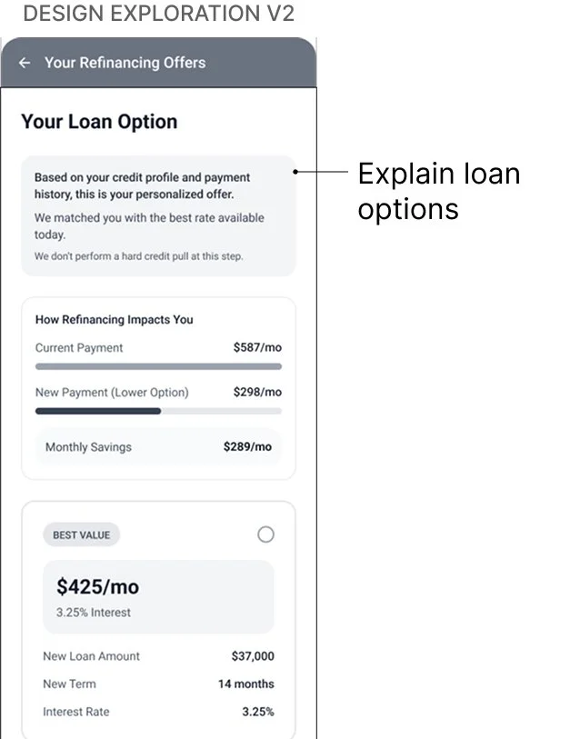
💡ASSUMPTION (V2)
A more detailed explanation of the new offer will help customers understand the value
🔴 USABILITY TEST
Too text-heavy - customers didn’t want to read multiple screens, and still couldn’t quickly see the benefit
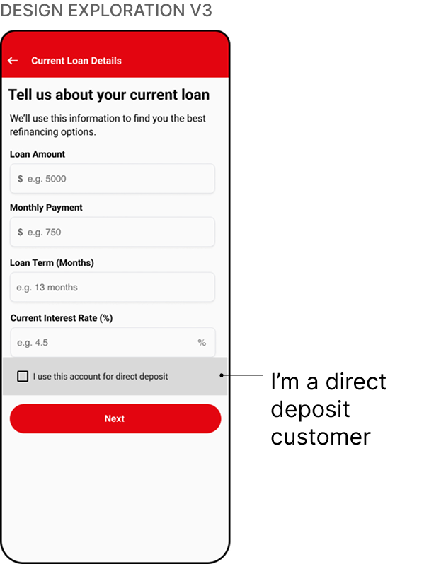
💡ASSUMPTION (V3)
Direct-deposit customers can bypass the document upload entirely
🟢 USABILITY TEST
This matched customer expectations and performed best in testing
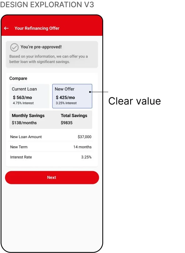
💡ASSUMPTION (V3)
Showing the current loan and new loan side by side will make the value immediately clear
🟢 USABILITY TEST
Customers quickly understood payments, savings, and total benefits without extra reading
FINAL DESIGN
IMPACT
21% increase in refinancing completions within 30 days
*Data collected via product analysis one month after the launch
REFLECTION
A key takeaway was how sensitive users were to wording, sequencing, and tone in a high-trust flow. If I were to revisit this project, I would run more focused experiments on value messaging and eligibility guidance to understand which framing builds confidence fastest.