IstoVisio · B2B · VR · Science
Reimagined VR Menu
for Global Scientific
Discovery
syGlass · May 2024
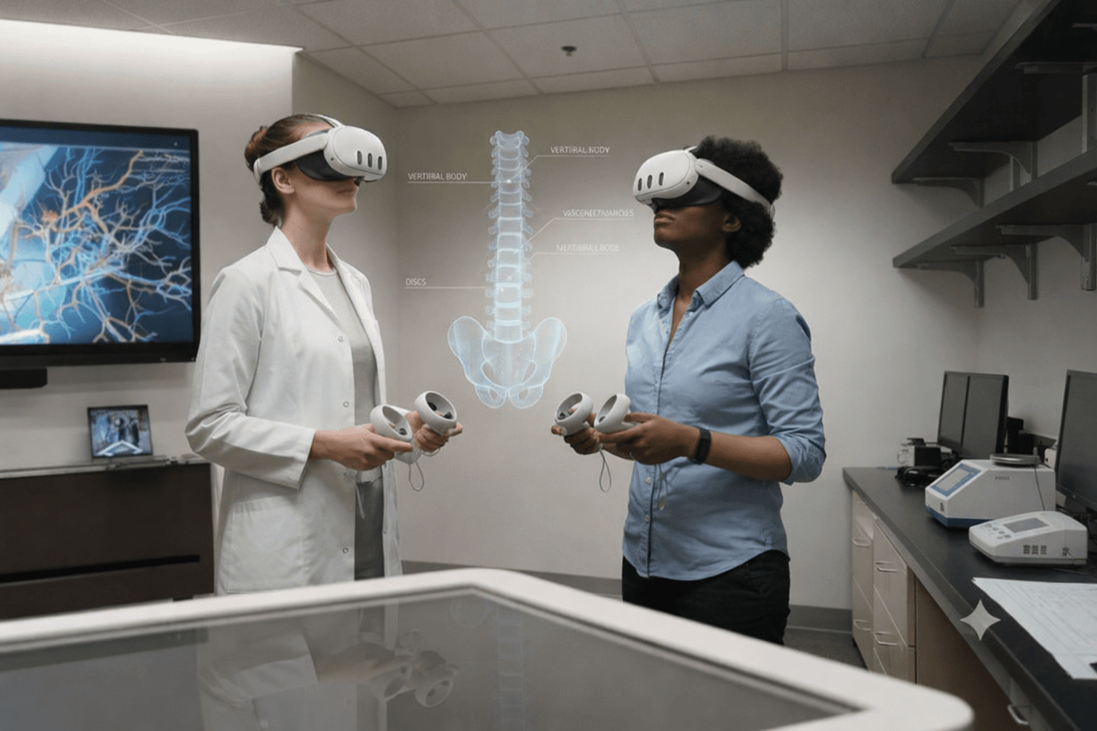
syGlass is a VR-based scientific visualization platform that helps scientists explore and analyze massive 3D datasets. As the platform evolved, the menu system grew to support an increasing number of tools and workflows, making navigation a critical part of the overall user experience.
The project focused on reducing workflow friction and improving access to high-frequency tools so scientists could stay focused on analysis instead of interrupting their workflow to search for functionality.
Problem
syGlass offered powerful scientific capabilities, but the product experience had become a barrier to efficient scientific workflows. Scientists constantly switched between tools while analyzing complex datasets, yet the interface required them to repeatedly scan through a dense list of tools to find the functionality they needed. These interruptions increased the risk of users switching to alternative solutions with simpler workflows.
The business needed to improve usability and reduce workflow interruptions without sacrificing the advanced functionality scientists relied on, while also helping reduce customer churn.
Solution
I redesigned the tool navigation system to make tools easier to access and faster to learn.
The redesign included:
- • Creating a more adaptive workflow experience tailored to how individual scientists work by allowing users to pin and preserve frequently used tools directly within their workflow
- • Reorganizing tools based on behavioral usage patterns and workflow frequency
- • Grouping tools by task context to make functionality easier to understand and navigate
Impact
Post-launch feedback showed that 80% of users were more satisfied with the updated experience.
The redesign also:
- • Reduced time spent locating and switching between tools from minutes to instant access
- • Improved onboarding by simplifying navigation patterns and reducing usability friction
- • Created a more scalable foundation for future product growth
My role
As the founding designer, I:
- • Led the redesign across research, UX strategy, interaction design, and workflow optimization
- • Collaborated with scientists and cross-functional teams to identify workflow bottlenecks and redesign the navigation experience
- • Created a scalable interaction system that balanced usability with the complexity required for advanced scientific analysis
Before
After
When I joined the team, syGlass was already a powerful scientific platform used for advanced 3D data analysis, but the navigation experience had become increasingly difficult to use as workflows grew more complex.
Over eight months, I led the redesign of the menu system to improve how scientists navigate and interact with the platform. The challenge was redesigning the interaction model in a way that improved speed and usability while preserving the flexibility advanced users relied on.
This case study focuses on one key part of that transformation: redesigning tool navigation to help scientists stay focused and move through complex analysis workflows more efficiently.
To better understand workflow friction inside syGlass, I conducted structured interviews and observational sessions with seven scientists across the United States and Europe. The goal was to understand how researchers navigated between tools during real analysis tasks and identify where the experience disrupted focus, speed, and workflow continuity.
“I know the tool exists somewhere, but every time I need it, I have to stop and search for it again. After a while, it starts breaking your concentration.”
Research Scientist · Paris, France
High-frequency workflows required repetitive navigation
Scientists constantly switched between a small set of frequently used tools, yet the interface required repeated searching and navigation during analysis sessions.
Tool organization did not match user mental models
Users often struggled to understand which tools supported specific tasks, leading to hesitation, trial and error, and slower workflows.
Navigation disrupted analytical focus
Even experienced users lost momentum when switching tools because the interaction model prioritized interface structure over workflow continuity.
I explored multiple navigation concepts that challenged the existing interaction model and reimagined how tool switching could work within complex scientific workflows.
To evaluate the initial directions, I conducted A/B usability testing sessions with five scientists ranging from novice to expert users. During the first round, participants tested two navigation concepts side-by-side to understand how different interaction patterns affected speed, focus, and workflow continuity during analysis tasks.
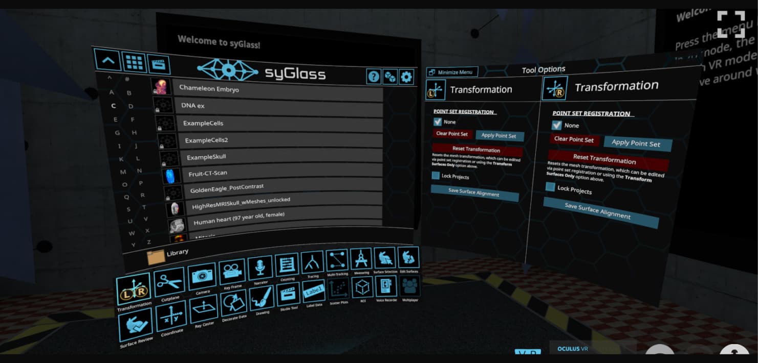
Concept A · Dropdown Navigation
If tools were hidden inside a dropdown menu, the interface would feel less overwhelming and easier to navigate.
While the interface appeared visually simpler, the experience introduced additional interaction steps. Scientists had to repeatedly reopen the dropdown every time they switched tools, which interrupted concentration and slowed workflow momentum during analysis sessions.
Reducing visual complexity alone did not improve usability. Scientists prioritized workflow continuity and speed over a cleaner-looking interface.
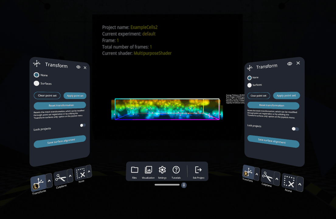
Concept B · Persistent Navigation Bar
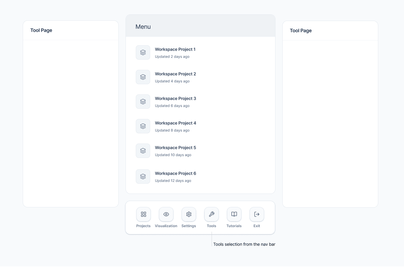
If tools remained visible in the navigation bar, scientists would find them faster and switch between them more efficiently.
Visibility improved, but users still had to repeatedly scan through a dense list of tools during analysis sessions. Although scientists understood where tools were located, the interaction model still felt inefficient for high-frequency workflows.
Discoverability solved only part of the problem. Scientists needed a navigation system that adapted to how they actually worked.
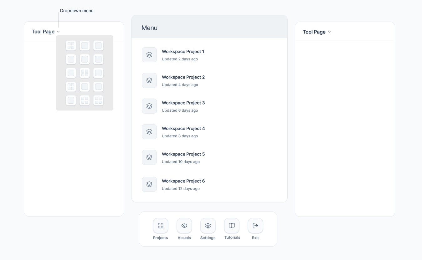
After analyzing feedback from the first round of usability testing, I identified the strengths and limitations of each navigation model and used those insights to develop a third concept. Building on what users valued most, I designed a solution focused on workflow personalization and persistent tool access, then returned to the same group of scientists to validate the direction.
Concept C · Personalized Workflow System
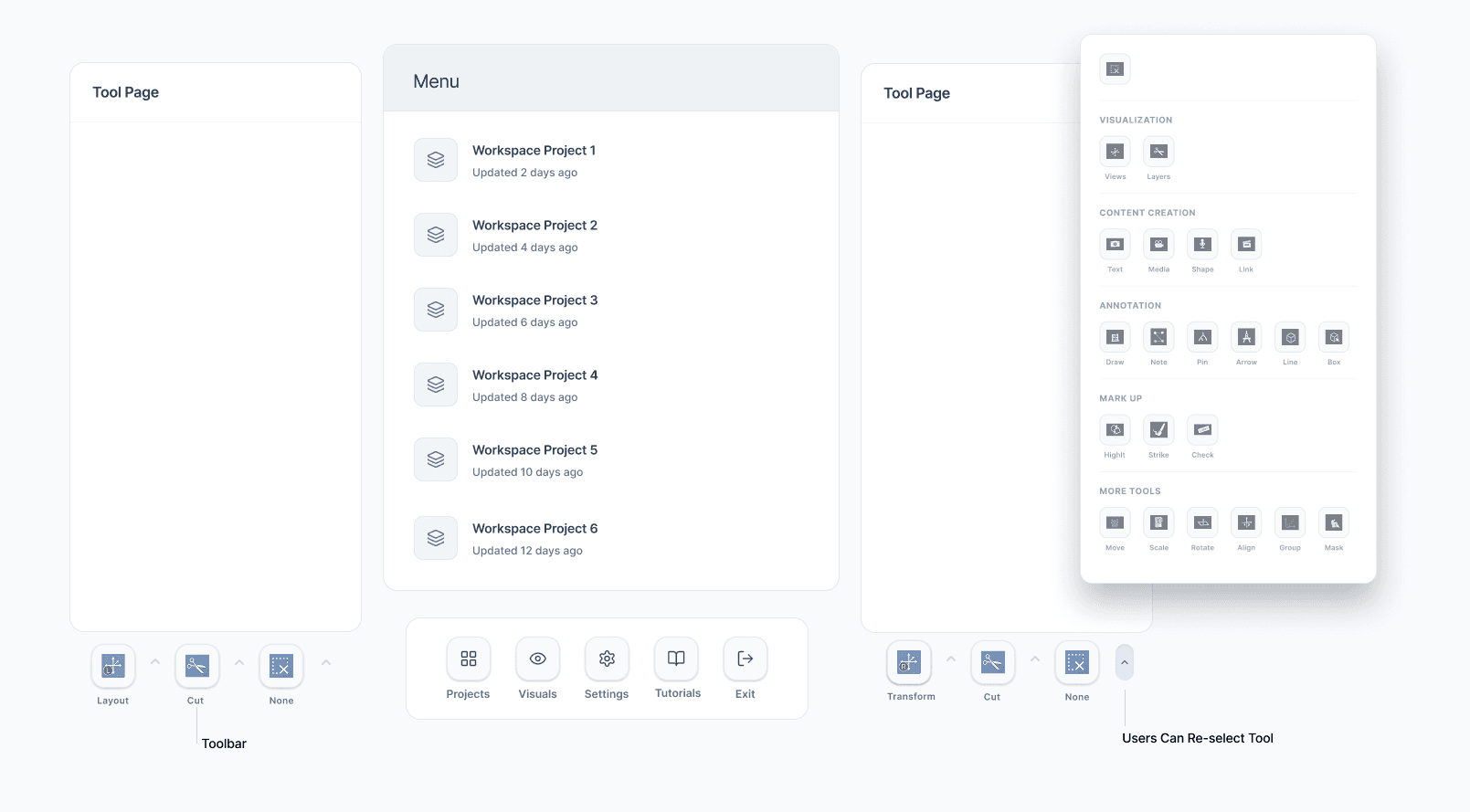
Allowing scientists to customize and preserve frequently used tools directly within their workspace would reduce workflow interruption and create a faster, more adaptive analysis experience.
This concept performed significantly better than the previous directions. Scientists were able to switch tools instantly without repeatedly searching through navigation layers, allowing them to stay focused during analysis sessions.
The ability to pin and preserve frequently used tools became one of the most valuable improvements because it adapted the interface to individual workflows. Tools were also grouped by task context, making functionality easier to scan and navigate during complex workflows.
The strongest solution was creating a navigation system that adapted to how scientists actually worked.
The final design combined personalized tool access with task-based organization, allowing scientists to tailor the interface to their workflow and quickly switch between frequently used tools. By reducing the time spent searching for functionality, the experience supported faster, more focused analysis of complex datasets.

Post-launch survey data showed an 80% improvement in overall user satisfaction within the first 30 days after launch.
The redesign reduced time spent locating and switching between tools, improved onboarding for new users, and helped scientists maintain focus during complex analysis workflows.
* Survey data collected from 32 participants.
Scientists work in highly precision-driven environments where even small interruptions can disrupt analytical focus. One of the biggest insights from this project was realizing that the cost of switching tools was not just additional interaction time, but the cognitive effort required to repeatedly pause, search, and reorient during analysis.
By making tool access more predictable and adaptive to individual workflows, the redesign reduced cognitive load in a way users immediately noticed. The project reinforced how meaningful UX improvements often come from removing friction within existing workflows rather than adding new functionality.