
Aeyesafe · B2B · SaaS · Healthcare
Built an Alert System to Improve Safety in Senior Care
SENIOR CARE SAAS PLATFORM
AEYESAFE · OCTOBER 2023
USERS: CAREGIVERS, CARE HOME ADMINISTRATORS
An AI-powered platform that supports senior safety while preserving independence and privacy. Using non-wearable sensors, it continuously detects changes in movement and daily routines without requiring user interaction. The system prioritizes early awareness over emergency-only alerts, enabling caregivers to intervene sooner and more effectively.
My role: Product Designer
What I owned: Problem framing, research, interaction design, alert logic UX, visual system and edge cases
PROBLEM TO SOLVE
Unclear alerts under time pressure can delay response to critical safety events, directly impacting resident safety
THE 6-WEEK SPRINT
I had six weeks to take the alert system from idea to something real teams could use. That short window meant every decision had to support a complete, working flow that could run in an actual care home.
RESEARCH INSIGHTS THAT SHAPED THE MVP
CAREGIVERS DID NOT RESPOND TO ALERTS QUICKLY ENOUGH
Alerts were raised, but responses often lagged, so the system couldn’t reliably trigger timely action
I needed a research approach that would quickly give me a solid foundation to start designing the alert system. I focused on existing alert tools in senior care, looking for patterns in how they helped, or failed to help, people act under pressure.
These three insights became the guardrails for Aeyesafe’s alert design.
INFORMATION DENSITY MADE IT HARD TO ACT FAST
Caregivers view too much data at once, which makes it difficult to see what changed and decide what to do first

ALERTS WERE SCATTERED ACROSS MULTIPLE CHANNELS
Notifications lived in dashboards, emails, and texts, forcing caregivers to hunt for information instead of staying focused on residents
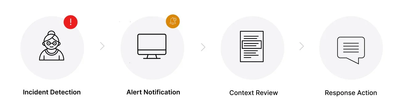
FROM DETECTION TO ACTION
I mapped the end-to-end flow from “incident detected” to “caregiver took action.” This clarified where the system should step in, where humans decide, and where things typically break down today.
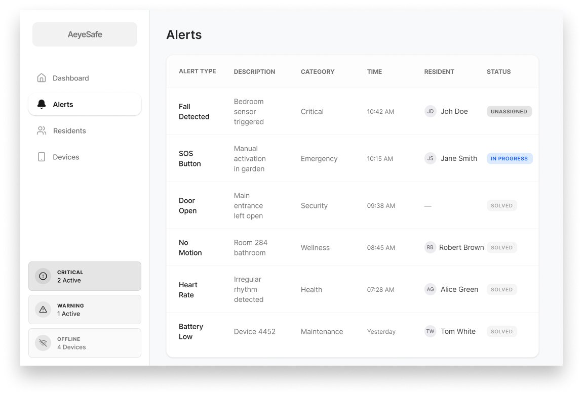
CENTRALIZING VISIBILITY
I started with a centralized alert page to give caregivers a single place to see everything happening across the facility.
The assumption was simple: if all alerts were clearly visible in one place, fewer incidents would be missed.
This was a fast, low-risk way to test whether visibility alone could improve response quality.
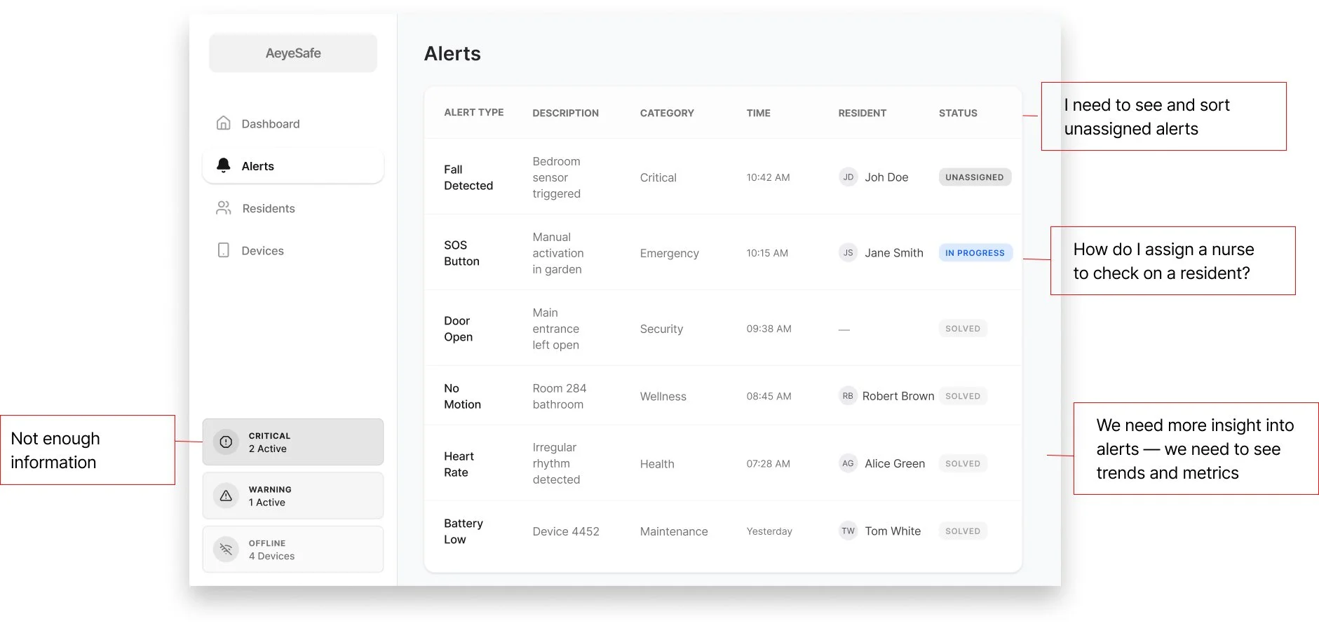
TESTING THE IDEA WITH CAREGIVERS
To stress-test the central alert page, I asked caregivers how alerts actually show up in their day and where they expect to see them. They liked having a central view, but they don’t live on a single screen.
That feedback flipped my assumption: instead of designing one destination for alerts, I needed alerts that could follow their workflow.
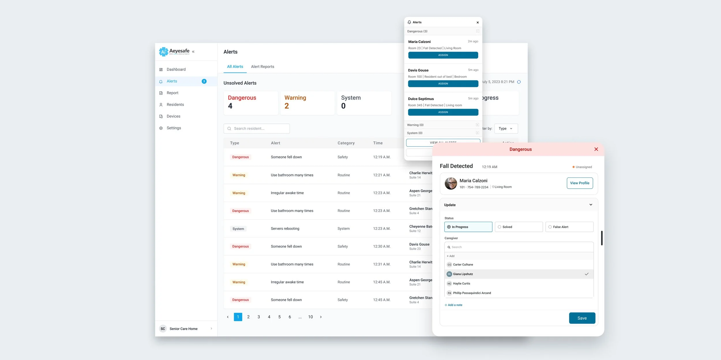
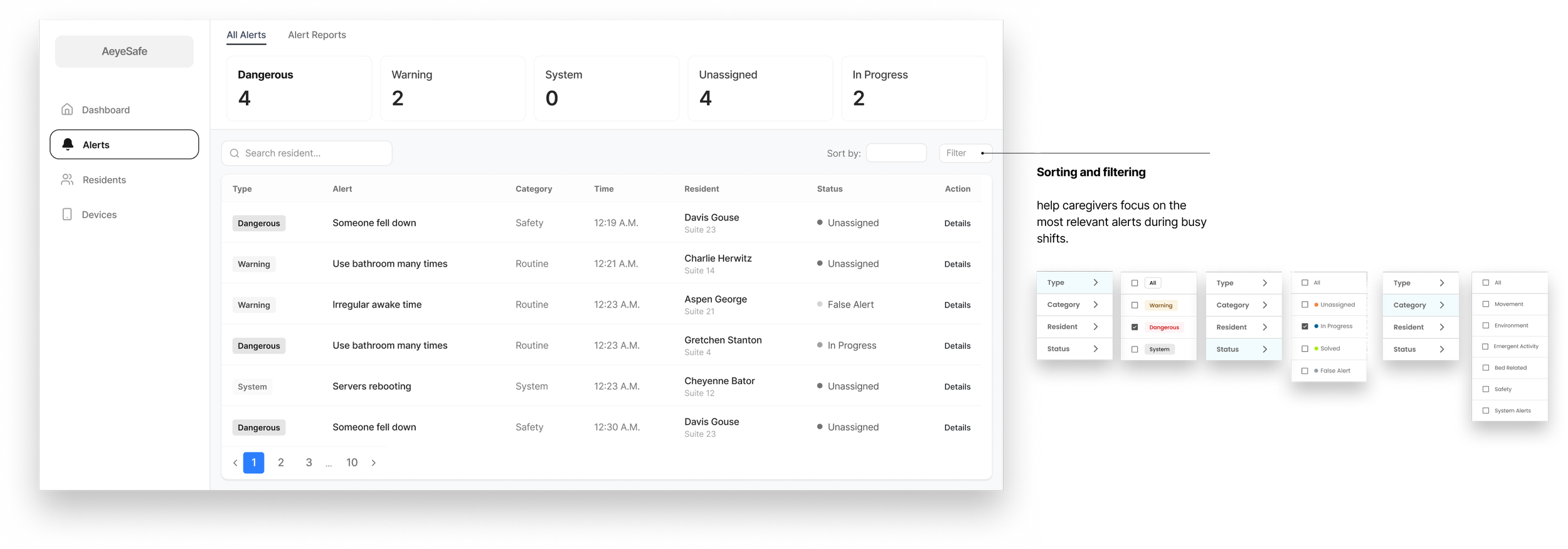
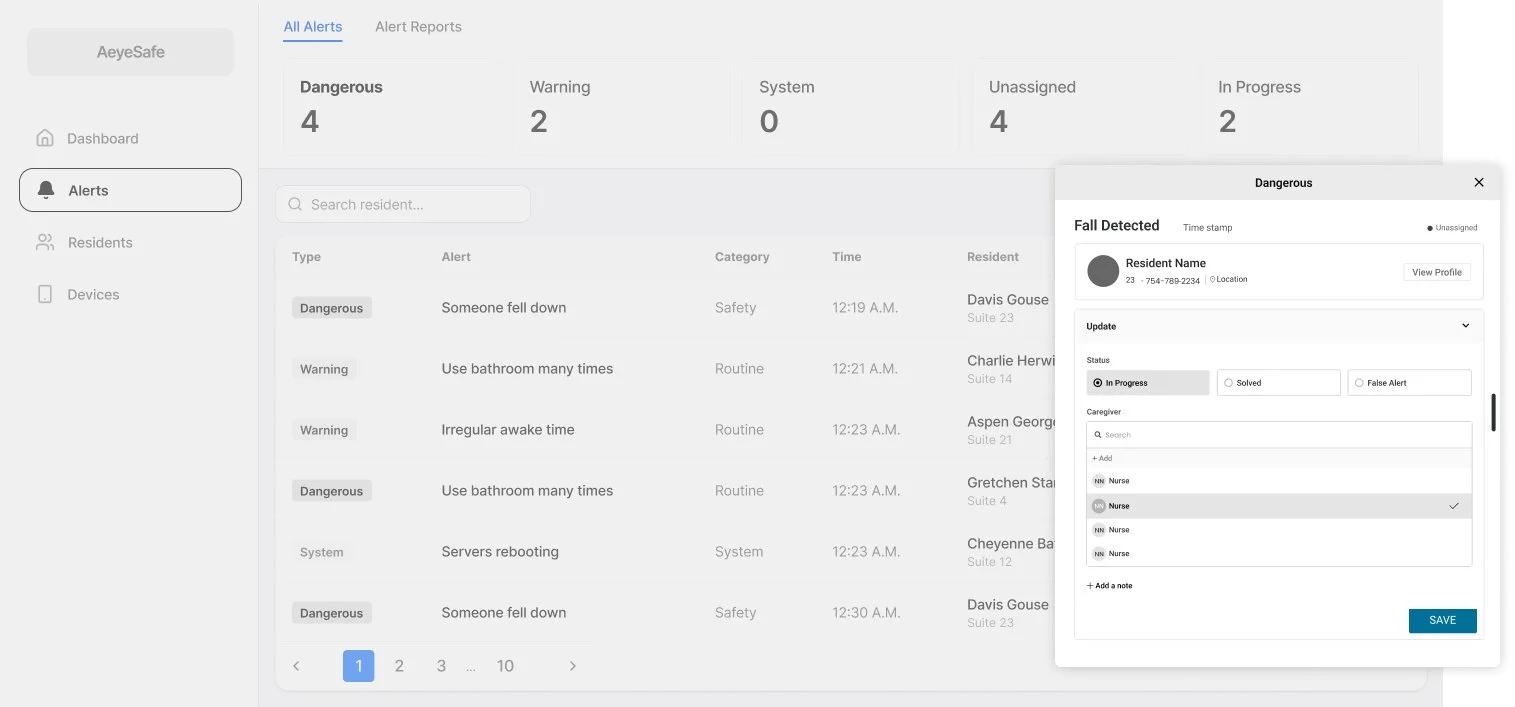
MAKING ALERT STATUS IMPOSSIBLE TO MISS
I redesigned the alert view so every active alert shows its status and owner, not just its message.
Unassigned alerts are called out clearly, which makes hidden risk visible and gives the team a starting point for action.
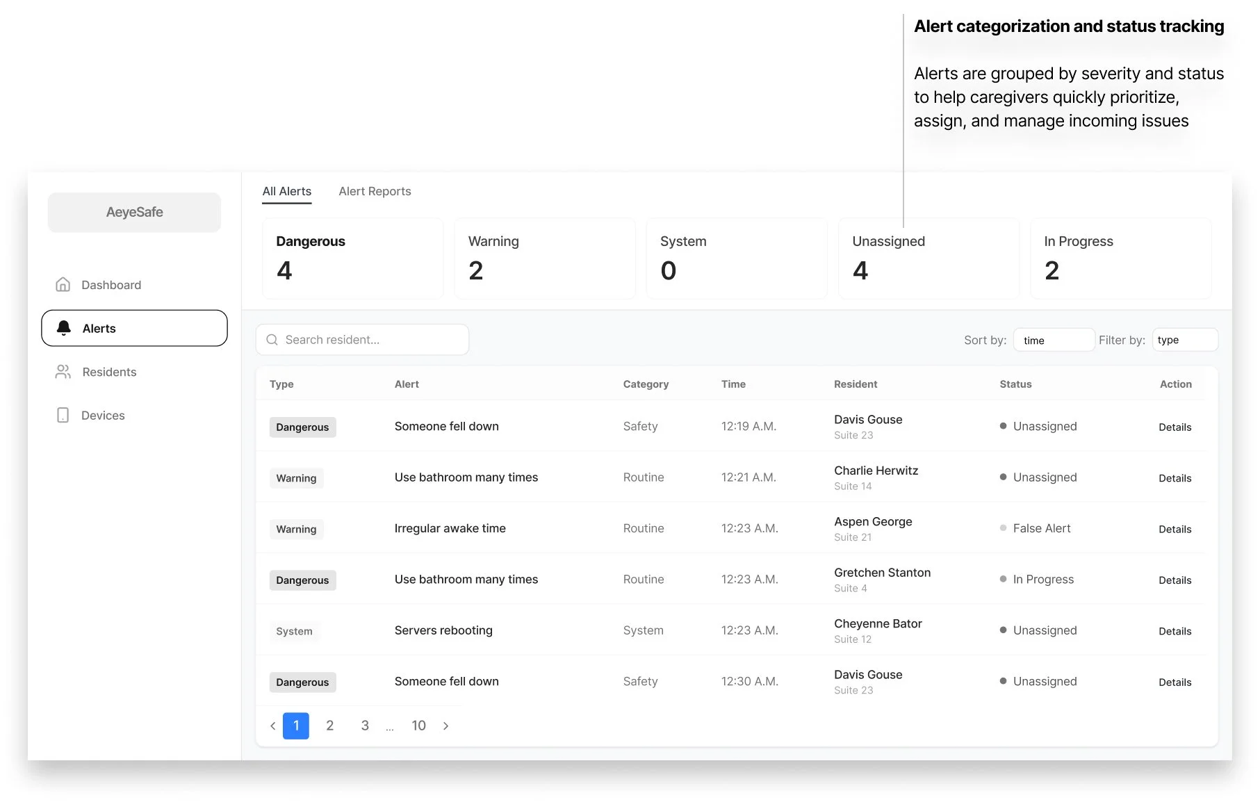
DESIGNING FOR FOCUS
I added simple tools like sorting, filtering, and “assign” buttons right where alerts appear so caregivers could quickly see what needed attention first.
Instead of scanning a long list or clicking around the product, they could narrow the view (for example, only urgent or only unassigned alerts) and act in seconds.
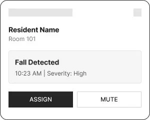
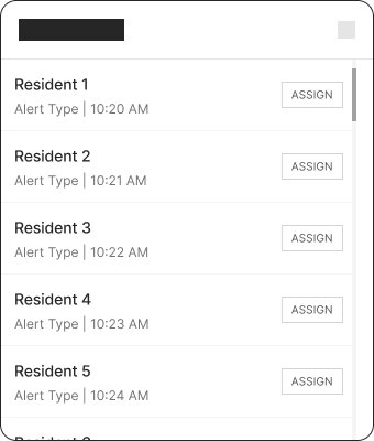
HANDLING HIGH ALERT VOLUME
ITERATION A
Single Pop-up
🟢 Works well for isolated alerts
🔴 Breaks under load
ITERATION B
In peak moments, the system can generate more than 15 alerts in a few minutes, so showing each one as a pop-up would overwhelm staff and block their work.
Through iteration, I moved to a stacked, compact alert panel that keeps critical details visible, supports quick action, and preserves enough screen space for ongoing tasks.
Expanded List
🟢 Prevents visual overlap
🔴 Increases cognitive load
ITERATION C
Collapsible Grouping
🟢 Scales to high alert volume
🟢 Balances urgency and clarity
OWNERSHIP AND NEXT STEPS IN ONE PLACE
A key gap was knowing who was actually handling each alert and what should happen next.
I introduced a consistent pattern where staff can assign, resolve, or mark an alert as false from any surface it appears, while always seeing who it involves, when it happened, and where.
FINAL DESIGN
IMPACT
Delivered a lean MVP that moved the team from idea to live pilot
Established data foundations to test AI accuracy and user adoption in real conditions
Reduced product risk by creating a clear path to learn, iterate, and demonstrate early traction