
IstoVisio · B2B · VR · Science
Reimagined VR Menu for Global Scientific Discovery
syGlass
ISTOVISIO · May 2024
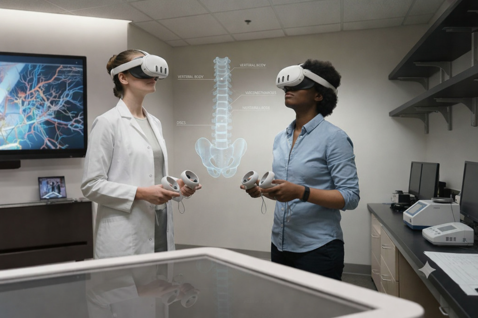
This platform helps scientists explore massive, complex datasets and reveal patterns they couldn’t see before.
As the founding designer, I shaped the product from its earliest sketches to its release-ready interface. I defined the UX strategy, guided all design decisions, and built the foundation for a scalable system that supports real scientific breakthroughs.
PROBLEM TO SOLVE
BUSINESS GOAL
Scientists needed to switch tools every few minutes, but the tools were hidden in a menu. Every time they opened it, they lost focus and slowed down. Over time, this became frustrating enough that many stopped using the product and moved to other tools.
Increase tool discoverability to reduce user frustration, lower support requests, and prevent churn.
BEFORE

AFTER
EIGHT MONTHS. FULL MENU REDESIGN. ONE DESIGNER.
I worked as the sole designer to reimagine the entire menu legacy system.
In this case study, I focus on one key piece of that transformation - improving tool navigation so scientists can switch tools without losing focus or breaking their workflow.
WHAT CUSTOMERS SAY
Tools lacked conceptual clarity
Users often couldn’t tell how specific tools connected to their tasks, leading to hesitation and trial-and-error.
I interviewed scientists and observed them switching tools to see where they got stuck.
“I know the tool exists, but I can never remember where it lives. It shouldn’t be this hard to find something I use so often”
Navigation didn’t match user expectations
Even when users knew a tool existed, the interface didn’t help them quickly locate it, causing confusion and wasted time.
High-frequency tools weren’t easily accessible
Users rely on certain tools constantly, but the design didn’t prioritize quick access.
EXPLORING DESIGN SOLUTIONS
I explored multiple design directions that challenged the existing structure and reimagined what intuitive tool navigation could look like.
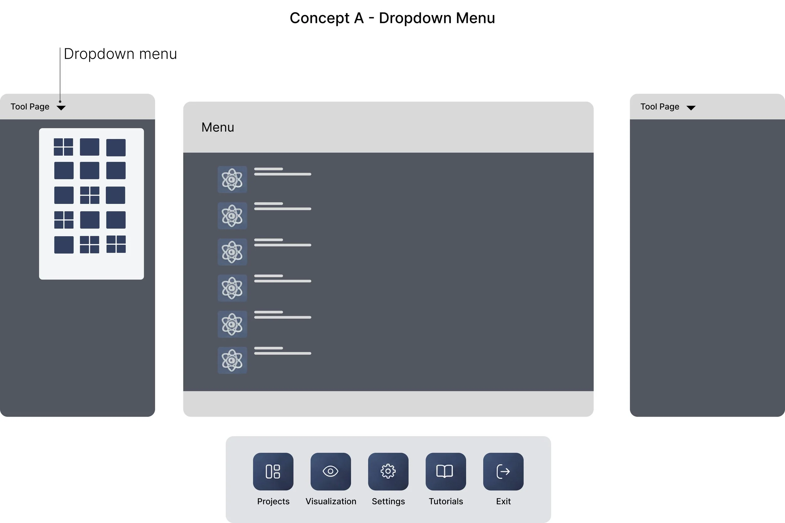
💡 Assumption
If we hide tools in a dropdown, the interface will feel less overwhelming.
🔴 Usability Testing
Users felt slowed down. Reopening the dropdown for every tool switch broke focus and added extra steps.
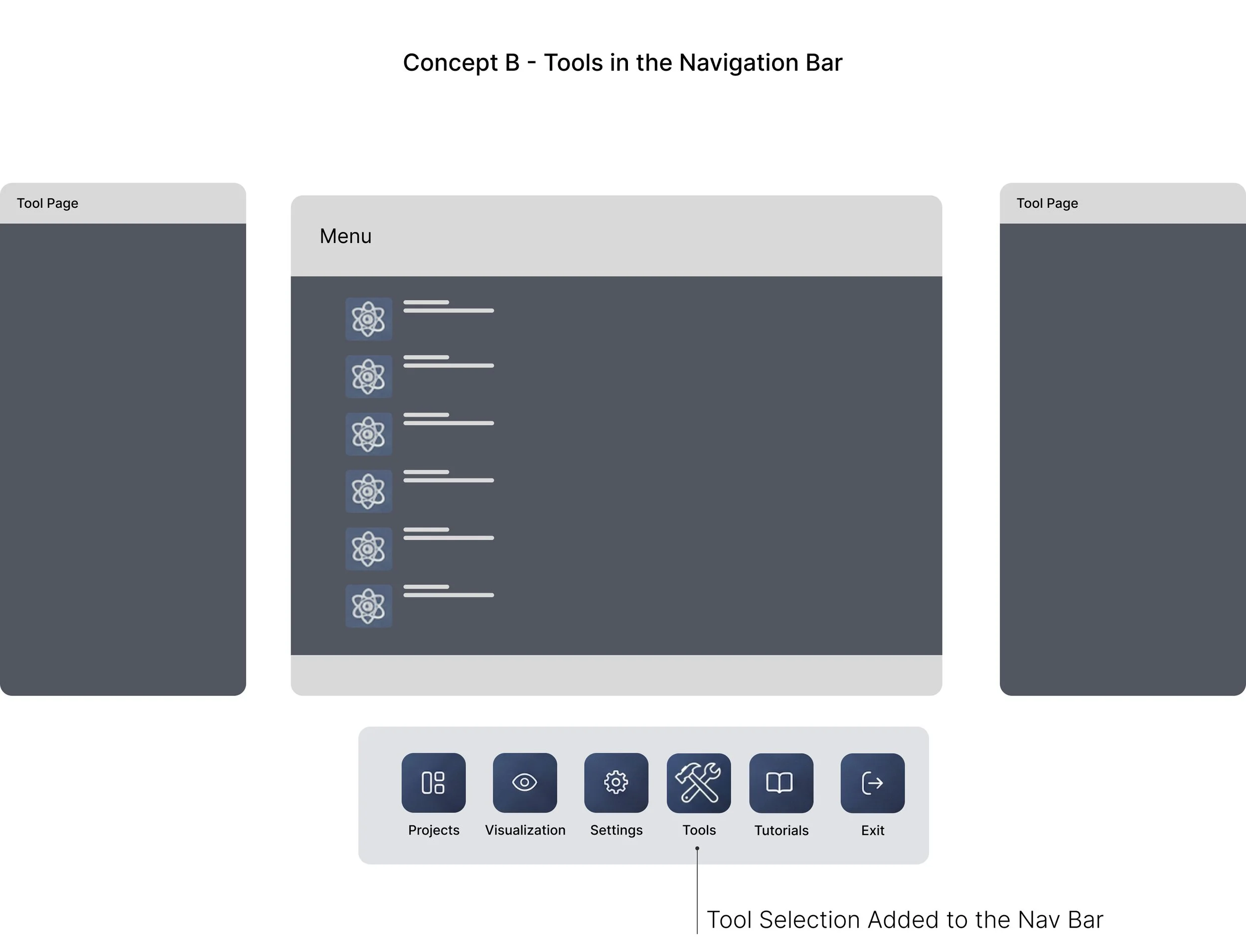
💡 Assumption
If tools are visible in the nav bar, users will find them faster.
🔴 Usability Testing
Visibility improved, but switching still required extra clicks. The workflow didn’t feel any faster.
💡 Assumption
If tools stay on screen, users can switch instantly without losing focus.
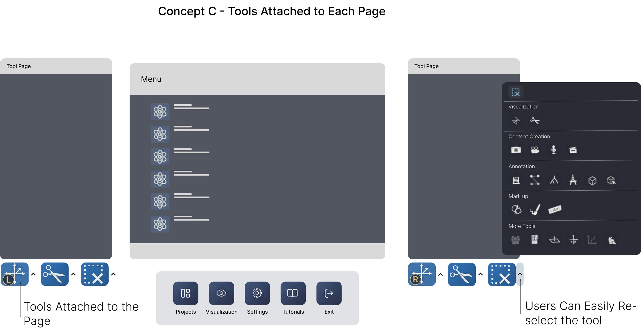
🟢 Usability Testing
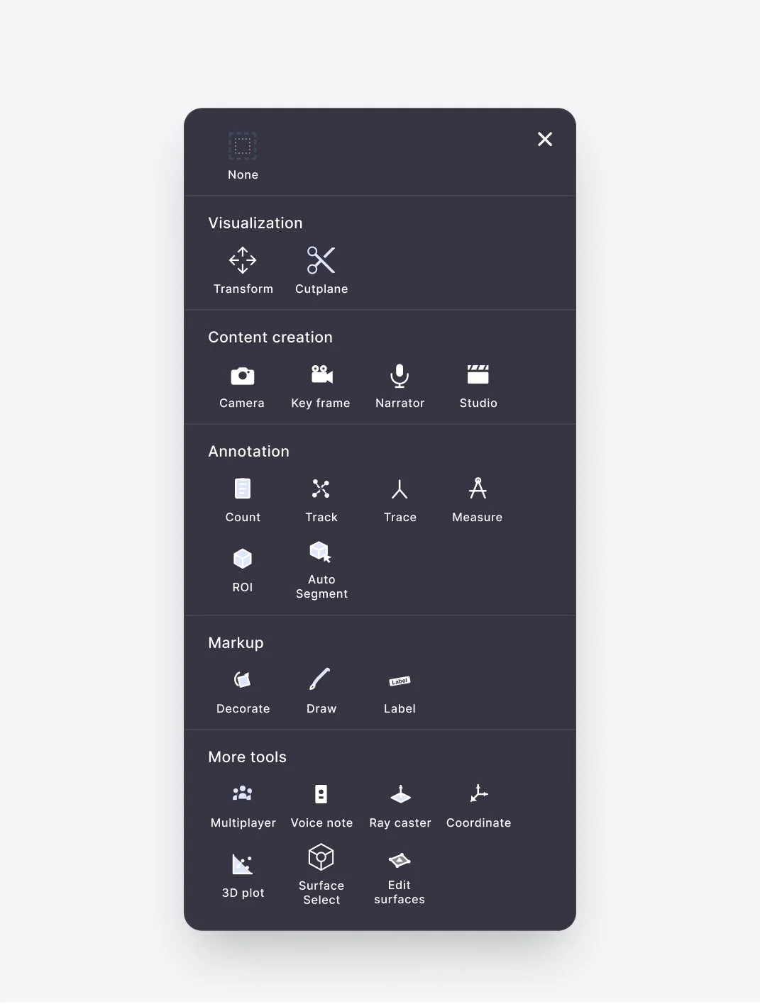
This approach worked best. Switching was fast and effortless - users clicked the arrow, selected a tool, and it stayed active until they changed it again. Tools were also grouped by topics (e.g., video creation, annotation), making it easier for scientists to find the right tool without breaking their flow.
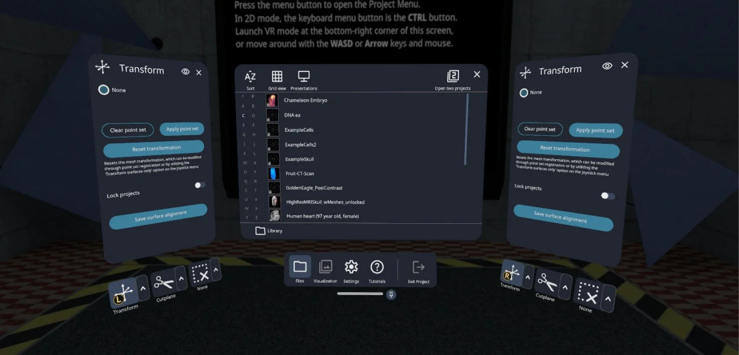
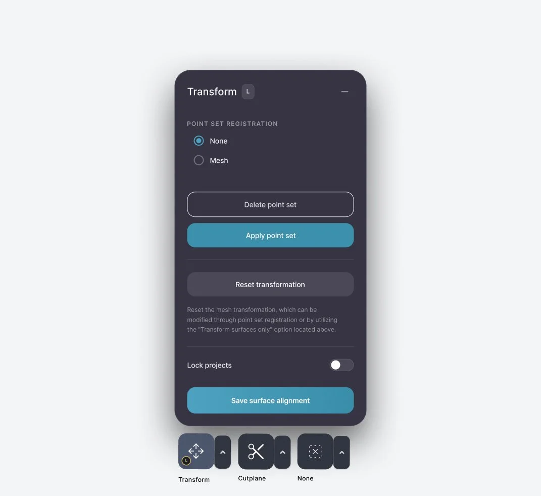
FINAL DESIGN
The final design keeps tools within constant reach, grouped by topics, and easy to switch with one click. This model supported the way scientists actually work: moving quickly, maintaining precision, and staying fully in flow.

RESULTS
*Data collected via a post-launch survey with 32 participants
Users reported an 80% improvement in their overall experience within 30 days
REFLECTION
Scientists do precision-heavy work, and even brief interruptions stack up. I learned that the cost of switching tools wasn’t just an extra click - it was a break in concentration. Designing predictable tool navigation reduced cognitive load in ways users immediately felt. This project reminded me that sometimes the biggest impact comes from removing friction, not adding features.
WHAT I’D EXPLORE NEXT
I’d focus on understanding how tool usage evolves. As workflows shift and new features are added, the system should adapt with them, whether through customizable layouts or surfacing tools based on recent activity. Building on this foundation would ensure the navigation continues to support users as their needs grow.