

My role:
Lead UX Designer & Researcher
Product
Business goal
Before & After
Redesign Timeline & Process
Evaluation of the existing process
Current workflow & suggested improvements
Interviewing teachers
What teachers said
“I want to minimize how long it takes for students to log in as it’s currently the most time-consuming part”
Team:
UX Consultant
Lead Engineer
Front-end Engineer
“I need full visibility of what happens in VR because we frequently work in two classrooms. If something doesn’t work, I can address it immediately.”
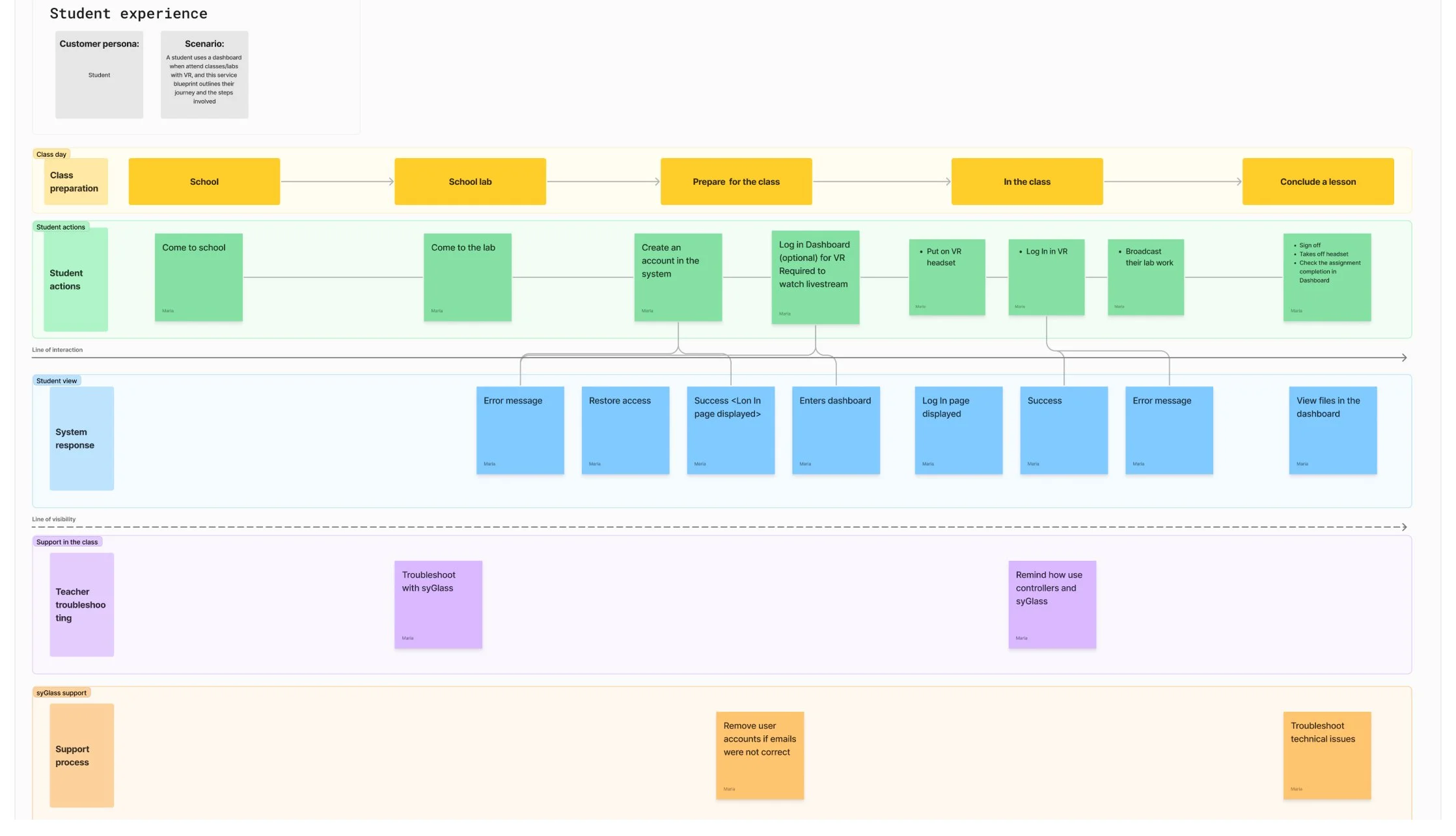
Service blueprints
Design & Testing
Project:
syGlass Dashboard Redesign (Web) | Education
Launched in 2023, syGlass brings immersive 3D learning to K-12 and college-level STEM students. With interactive lectures in subjects like neuroscience, anatomy, and environmental science, the platform is used by over 10 schools, reaching 500+ students and enhancing their learning experience through advanced visualization.
Problem
Teachers struggled with monitoring student progress and navigating the highly technical dashboard during syGlass VR lessons, while students frequently encountered login issues due to forgetting their credentials.
Minimize the need for engineering support by making the user interface more intuitive, enhancing the dashboard's guidance features, and improving overall learnability.

With a tight deadline, we aimed to complete the redesign by July to allow time for usability testing before the Fall semester. Our process included the following key steps:
Review Current Workflow
Conduct Teacher Interviews
Create Service Blueprints
Wireframing & Usability Testing
Development
I led a meeting with the engineering team to assess the workflow and identify technical enhancements to boost efficiency and user experience. We evaluated their feasibility to ensure alignment with the project timeline.

I conducted interviews with teachers, though I was limited to three due to the summer break. Despite the small sample size, the findings were crucial in validating the new concept developed during our initial kick-off meeting.
“Finding information on students is hard. Organizing the data by class, in alphabetical order, and with time stamps would be very helpful.”
I created service blueprints to gain a detailed understanding of the services we provide, along with the associated resources and processes. This approach helped uncover key areas for optimization and improvement.

I led feature prioritization meetings with a UX consultant and the engineering team, assessing both user value and engineering effort. Once we finalized the priorities, I created low-fidelity prototypes and tested them with three teachers, making iterations based on the feedback.
Due to time constraints, I was only able to run one round of usability testing.
Based on usability testing and prior research, the following key design elements were developed:
Unified Registration and Login System
Previously, users had to register on one site, and the engineering team would manually add them as users to a separate platform, where they would then log in. To streamline this process we created a unified website for both account registration and login, eliminating the need for manual intervention and improving the user experience.

Teacher-Controlled Class Creation
The class creation process initially required significant involvement from syGlass, with teachers depending on the engineering team to set up classes and invite students. To streamline this, I designed a solution that enabled teachers to create classes and invite students directly, giving them greater control and autonomy while enhancing workflow effectiveness.

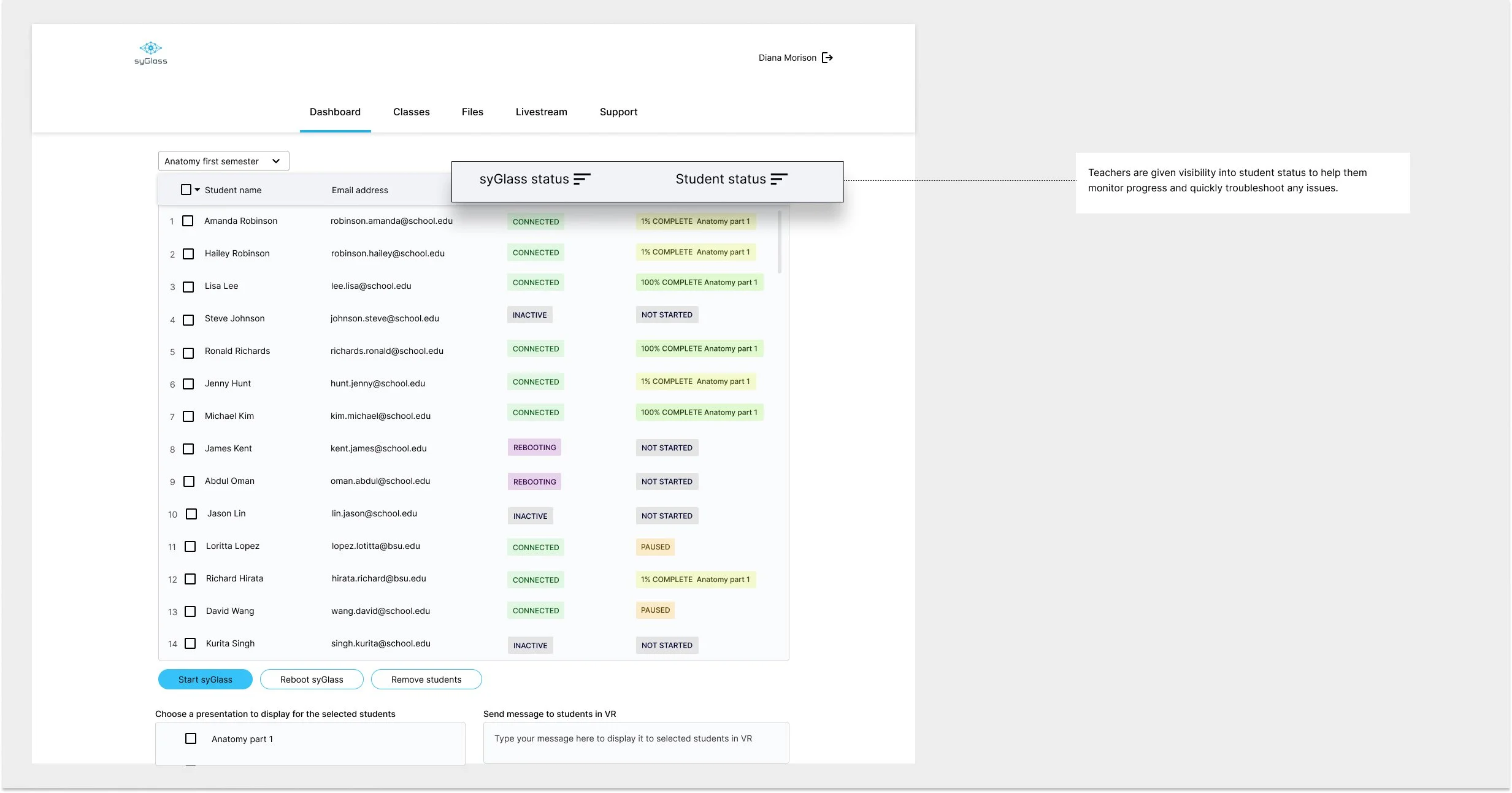
System Status Visibility and Improved File Organization
Teachers can now not only see whether students are in VR classrooms but also track their progress in real-time. Additionally, we enhanced file organization, allowing teachers to quickly locate and sort files as needed, improving overall efficiency.

Simplified Student Login Process
To address login issues and reduce the time students spend logging in, I introduced a new process where students only need to enter a 4-digit PIN instead of an email address and password. The email and password option remains available as a backup if students forget their PIN.

Results
The dashboard launched in mid-August 2024, and we are actively gathering feedback from both teachers and students.
Early feedback highlights several key improvements:
75% of teachers reported easier navigation
60% reduction in UI-related support requests
95% drop in user errors related to the student login issue.