

Problem
Scientists and researchers using syGlass encounter difficulties navigating its complex and unintuitive menu system, even after receiving personalized training. This limits their ability to efficiently recall previous actions and achieve their goals, impacting overall user productivity.
Business goal
syGlass, introduced in 2016, transforms scientific data annotation with advanced virtual reality tools. It empowers scientists to explore and analyze data in immersive 3D environments, revealing small details often missed in 2D.
syGlass has been referenced in numerous scientific publications across the US and Europe, highlighting its significant role in advancing data visualization and research accuracy.
Increase the intuitiveness and learnability of the menu system, reducing the need for personalized training while boosting user satisfaction and improving customer retention.
Analyzing the Current Menu System
When I joined the team, I initiated a deep dive into syGlass’ existing menu system, focusing on three key areas to drive improvements:
Customer Feedback Analysis: Identified that the absence of system guidance was preventing users from fully understanding the software's capabilities.
Usability Audit: Uncovered insufficient system feedback, leading to user confusion and an increased risk of irreversible errors.
Competitive Benchmarking: Highlighted that the current menu design did not align with established VR standards, such as Oculus and Vision iOS guidelines.
Tool Access: Users frequently use two or three tools and want quick access to them.
Project
syGlass menu redesign | 3D | VR
Product

Customization: Users want to customize their view, including control over where menus open relative to the data.
Design
We dedicated approximately eight months to designing, usability testing, and iterating on the menu system. The primary challenge was to create an entirely new design without disrupting users' muscle memory or hindering their workflow—a task that initially felt overwhelming but drove our focus on seamless transition and efficiency.
Following the system audit, it became clear that some global functions needed relocation, and certain elements required repositioning to offer users a more comfortable and intuitive viewing experience.


I developed multiple design concepts for various elements of the menu system. Below are a few examples showcasing these designs.

Rebuilding complexity
We understood that we could not remove the complexity entirely because it would remove precision from the software. However, our goal was to reduce cognitive overload to make interactions more fluid.
New viewing angle for more comforable and effiicent work

Confirmation messages to help users feel in control and reduce user errors.

Old vs. New design
Usability testing
I led two rounds of usability testing, each with 8 users, iterating on the wireframes and collaborating with engineers to refine the prototypes.
What did not work and how we fixed it

Working closely with the team, we developed a high-level layout that aligned with our design goals. The new design was crafted to be intuitive and familiar, preserving users' muscle memory while incorporating VR best practices and core UX principles. This approach ensured that existing workflows remained efficient, and users could adapt seamlessly to the updated interface.
My role
Lead UX Designer & Researcher
The team
UX Consultant, Lead Engineer, Engineer
Principles & Goals
Based on the analysis, we defined core principles to guide the redesign:
Consistency:
Standardized the layout to enhance scalability and learnability, ensuring a seamless user experience.
System Response:
Improved feedback mechanisms to provide clear, immediate responses, reducing user hesitation and encouraging exploration.Intuitiveness:
Introduced clear visual cues, progressive disclosure, and interactive tutorials to create a streamlined interface for both novice and advanced users.
Research & Findings
To validate and deepen our understanding of the current menu system, I co-led user research with a UX consultant. We conducted contextual inquiries to identify misalignments between users' mental models and the system architecture, and in-depth interviews to uncover how syGlass could better address customer pain points.
Key insights from the findings included:


Feature Discoverability: Users are unaware of some useful functions within syGlass.

Over the course of three months, I led a series of meetings to refine and finalize the design concept. Following that, I developed high-fidelity wireframes and worked closely with the engineering team to guide the development of a VR prototype, which was later used in usability testing to ensure the design met user needs.
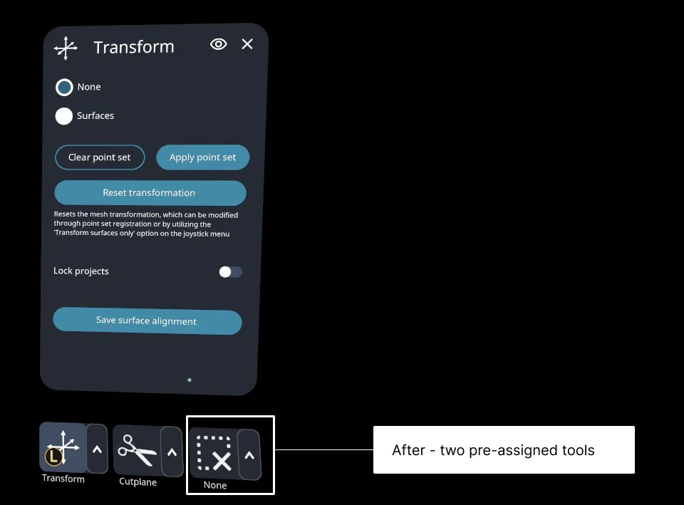
One key insight from the research revealed that users typically relied on 2-3 tools in syGlass. To streamline their workflow, we initially pre-assigned three tools. However, 6 out of 8 users preferred having only two pre-assigned tools, as the third tool often varied.
Based on user feedback, we refined the prototype by pre-assigning the two most frequently used tools. After retesting with users, the updated design successfully passed the usability test, confirming its effectiveness in streamlining workflows.
User interviews revealed a need for more menu flexibility. We enabled users to keep one or two pages open, allowing them to use tools while keeping the dataset visible. While hiding pages was intuitive, all 8 users struggled to re-open them, indicating a usability gap for further improvement.
To address the issue, I drew inspiration from the desktop apps and introduced animations with a prominent indicator bar to signal when a page was hidden. This solution passed the second round of usability testing, where all 8 users successfully reopened a tool page effortlessly.
After these iterations, I finalized the designs, which included the following key design elements:
80%
Satisfaction increases with the addition of three tools and improved ease of switching between them.
Redesign Impact & Next Steps
This redesign significantly improved the menu system’s learnability, allowing new users to navigate more efficiently while helping existing users discover overlooked features. Our next step is to address dependencies within the system to make advanced features more accessible, further enhancing user productivity in less time.
26%
improvement in learnability, along with enhanced speed-of-use and intuitiveness compared to the old version.
10%
improvement in customer retention after the new version of syGlass was announced in May 2024.